61.2970°N 23.5025°E
Tel. +358 50 433 7843
Email sami@bumblebee.fi
/////////////
© Sami Surakka 2025

Work/Tietoevry Patient Monitoring
2022–2024 ✦ Principal designer (interim)
Loading...
61.2970°N 23.5025°E
© Sami Surakka 2025
Problem
Clinicians couldn't scan patient data quickly or trust what they were seeing, starting from a single pilot district.
Solution
Design system from scratch and 5+ new clinical workflows enabling proactive home care.
New workflows designed
5+
Component library usage (survey)
69% daily/weekly
Products covered
2
Themes
Light + dark
I joined Tietoevry as an interim principal designer to redesign a remote patient monitoring system used by healthcare professionals caring for patients at home. The monitoring product's visual quality was not up to par, and the insights product, while in better shape, was visually disconnected. Beyond the visual overhaul, I designed entirely new clinical workflows, built a comprehensive design system, and helped modernize how development, design, and product management collaborated. The design system and workflows are still in active use after my departure.

The development team greatly benefited from Sami in planning the implementation, and based on the teams' feedback, Sami iterated the designs as needed. Over the year, the appearance of the products evolved in a more professional direction, making them pleasant to use.
Teemu Ekola, Head of Business @ Tietoevry Care (Data & AI)
The remote patient monitoring product family was functionally solid but visually inconsistent and dated. The monitoring product had inconsistent spacing, cluttered data layouts, and no clear visual hierarchy, making it harder for clinicians to quickly scan patient data and trust what they were seeing. Each product had evolved independently with no shared design language or component library. I was brought in to refresh the UI, bring cohesion across the family, and establish a sustainable design foundation.
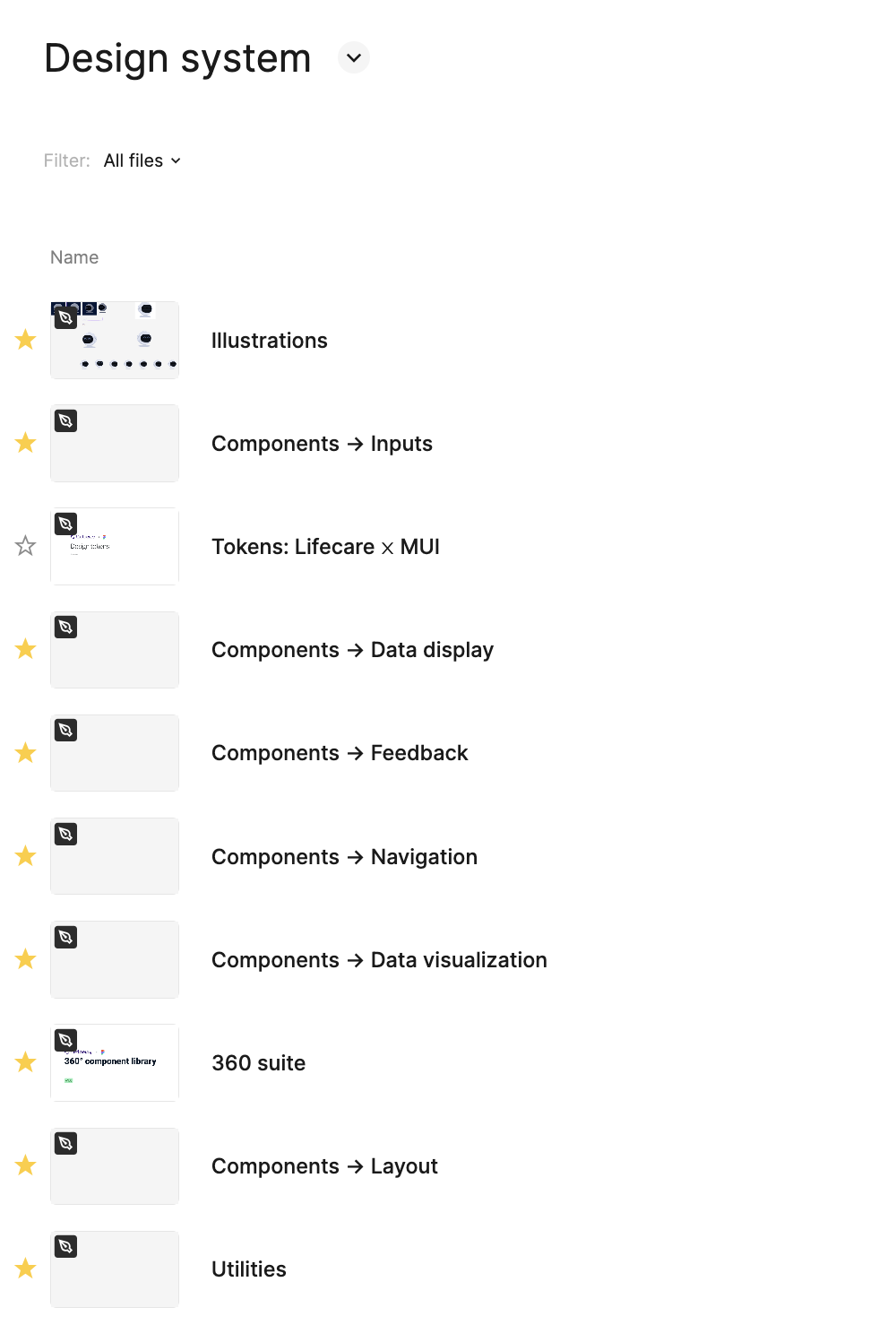
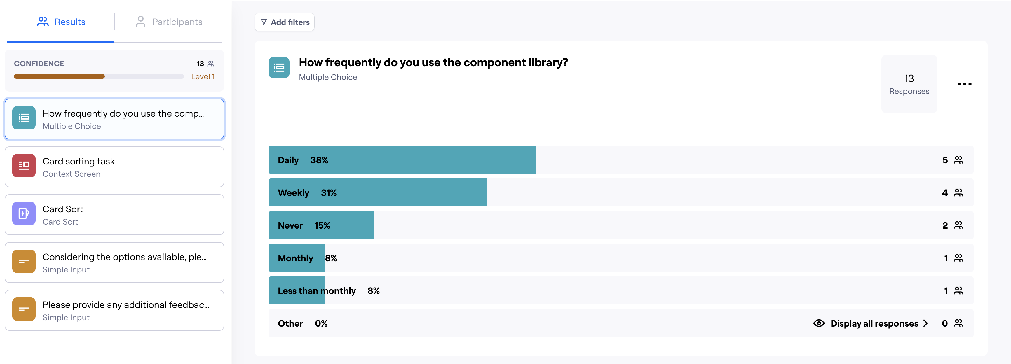
I started with a Figma library and an initial component set, then ran a card sorting study via Maze with the development teams to map information architecture and a survey to understand how often teams were already using the library. The survey showed 69% of developers were using the component library daily or weekly, which justified investing in a full design system. I also mapped friction points in Figma adoption and found that developers struggled to navigate and extract what they needed from it, a common issue in my experience. This informed the decision to invest in Storybook as the primary developer-facing interface. A lead developer then implemented it, making the system directly usable by both dev teams. I proposed a governance model where each team would publish implemented components back into the shared library, keeping the system federated rather than centrally bottlenecked. The resulting system covered foundations (color, typography, icons, effects), core components (buttons, inputs, alerts, dialogs, forms), and complex patterns: data display, data visualization, navigation, layout, and utilities. It supported both light and dark themes and was structured to serve two of the three products in the family. The third had a distinct audience and established identity, so we intentionally scoped it out.
The design system eliminated the need for a separate redesign of the Insights product: it inherited the updated visual language at near-zero marginal cost. Beyond the visual refresh, the Insights product included AI-harmonised patient stories: aggregated narratives compiled from patient data by the AI layer. I designed with Petri how these stories were presented to clinicians, balancing information density with readability under clinical time pressure. In collaboration with Petri, I also contributed to an experimental workflow for an AI recommendation engine that would surface suggestions based on patient data. This remained experimental during my engagement and I don't have visibility into whether or how it progressed. After my departure, the system remained in active use. Petri continued building on it, confirming it was self-sustaining rather than dependent on any one person.
Beyond the visual layer, I designed several entirely new clinical workflows from scratch.
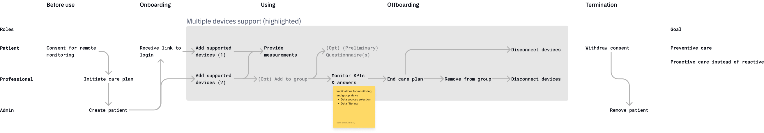
Patient group management with alarms and thresholds. An entirely new capability that shifted the care model from checking on individual patients to monitoring cohorts and responding to exceptions. Clinicians could set thresholds, receive alarms, and manage groups proactively rather than reactively.
Goal setting and tracking. New functionality allowing clinicians to set measurable health goals for patients and track progress over time, supporting more structured and outcome-oriented care plans.
PROMs and PREMs questionnaires. Designed both sides from scratch: how clinicians create and distribute Patient-Reported Outcome and Experience Measures, and how patients fill them in. These instruments are central to value-based healthcare, where care quality is measured through patient-reported data.
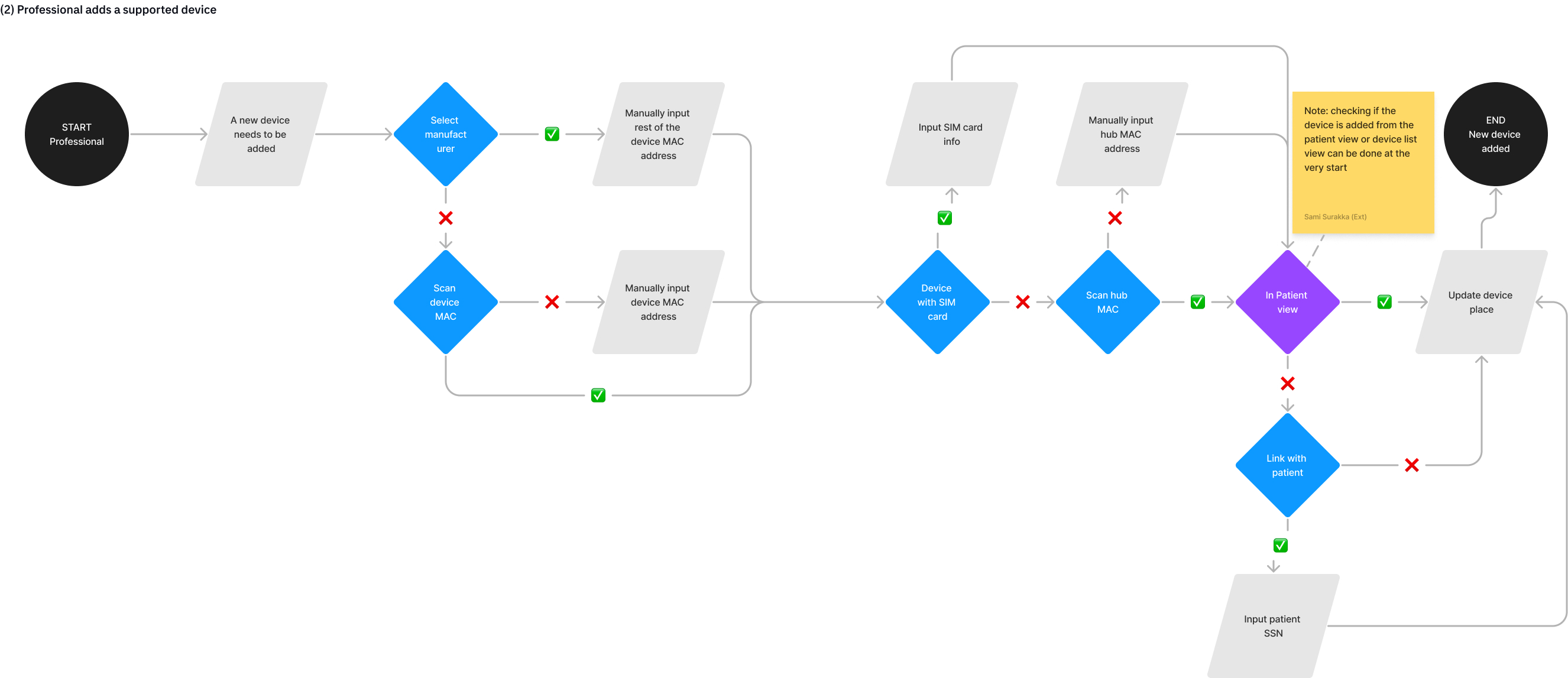
Remote device configuration. The capability to configure monitoring devices existed in the backend but was not exposed through the UI. I designed a workflow that let clinicians configure devices remotely, reducing the need for physical setup visits.
Daily dashboard. A complete redesign of the primary view clinicians use every day to review patient status, making it scannable and actionable where the previous version was a dense data dump.
I conducted interviews with internal subject-matter experts: medical doctors and nurses hired by Tietoevry to bridge the gap between clinical needs and product development. We attempted to arrange direct end-user access with clinicians in hospital districts but ran into regulatory constraints. The internal SMEs provided valuable clinical context that informed workflow decisions, particularly around alarm thresholds, questionnaire design, and the patient group monitoring model.
The monitoring product went from subpar visual quality to a coherent, professional clinical tool. The design system was adopted by two development teams and implemented in Storybook. Five new clinical workflows expanded the product's capabilities. Most notably, the patient group management feature enabled proactive rather than reactive care. The Insights product received the visual refresh at near-zero additional cost through the shared system. The products are deployed across hospital districts in Finland as part of the Lifecare platform. Later, an org-level decision reversed the original brief to maintain a distinct visual identity, requiring alignment with the Lifecare design language instead. Because I had built the system with theming in mind from the start, migration was a matter of mapping our design tokens to Lifecare and fitting our MUI library to match. The transition took days rather than weeks and required no structural rework.
I served as the principal designer for the product family. I owned the design system, the monitoring product redesign, and all new workflow designs. I also ran the research activities (card sorting, SME interviews) and aligned with development and product management on process improvements. Petri Tuominen focused on design for the other two products, and we coordinated closely to keep the system coherent while respecting product-specific needs.
Looking back, I would push even harder for direct access to end users. The internal SMEs were valuable, but there is no substitute for watching clinicians use the tools in their actual working environment. We tried, but regulatory constraints blocked us. With direct access, we could have made some of the interaction decisions with even greater confidence. It is a reminder that in healthcare, the gap between "we understand the domain" and "we have observed the workflow" can be significant.