Bumblebee Design
Identity and web design for our company
Note: this case study is for the previous version of the Bumblebee site. I have designed & launched a new version of the site in April, 2024.
- Why: we believe that good design is based on hive-mind like team work and communication
- How: Bumblebee Design will base its strategy on networks and partnerships to build a credible capacity to deliver value and impact to its clients
- What: this project is the first step on our journey towards independent design agency as entrepreneurs
My role
I am a founding partner with my spouse on Bumblebee Design. During this identity and web design project, I was responsible for the look and feel of the brand and delivering the web site and the domain integrations to other services. In short: design and implementation. My spouse is the CEO and "the Signer". The reader can decide if that adds up to the challenge of managing expectations and communication or not.
Process
The idea for our name came from my spouse - it is said to be one of the most beautiful words in English language. We started sketching our ideas on paper. We collected inspiration with Google from images pf bumblebees.
As we sketched, we sparred around ideas of our values and our vision and purpose. Finally, when it started to mesh, we started constructing our visual identity on Figma.
After a couple of iterations and validation rounds with other people than us our identity was solid enough to start designing our web page and its content.
Visual identity
Your logo is stolen
Since it is our business, we naturally were obsessing over the logo. Our first version looked like this:
![]()
We were not quite happy with it. It did not quite grasp our values of humility, collaboration, balance and prosperity nor our intended tone of playfulness with a touch of class. So we decided to radically simplify it.
![]()
The second version seemed to nail it. It was spot on. Toned down yet friendly and a bit of playfulness to it. We were happy, so we decided to test out initial reactions to our brand look. This was a reminder for us to never even think about skipping the testing and validation of a design. Our logo was stolen. It was the same as MasterCard brand had used in the past. Back to the drawing table.
![]()
The final version turned out even better. It speaks to us on a personal level, reflecting that our personalities mesh together and the square intersecting the circle works as a reference to the multitude of design tools as well. Collaboration happens at the intersection of our knowledge. Circle symbolizes balance. The overall shape is remniscient of the "double diamond" of a design process.
It is the best logo I have ever designed. It might still be stolen from somewhere.
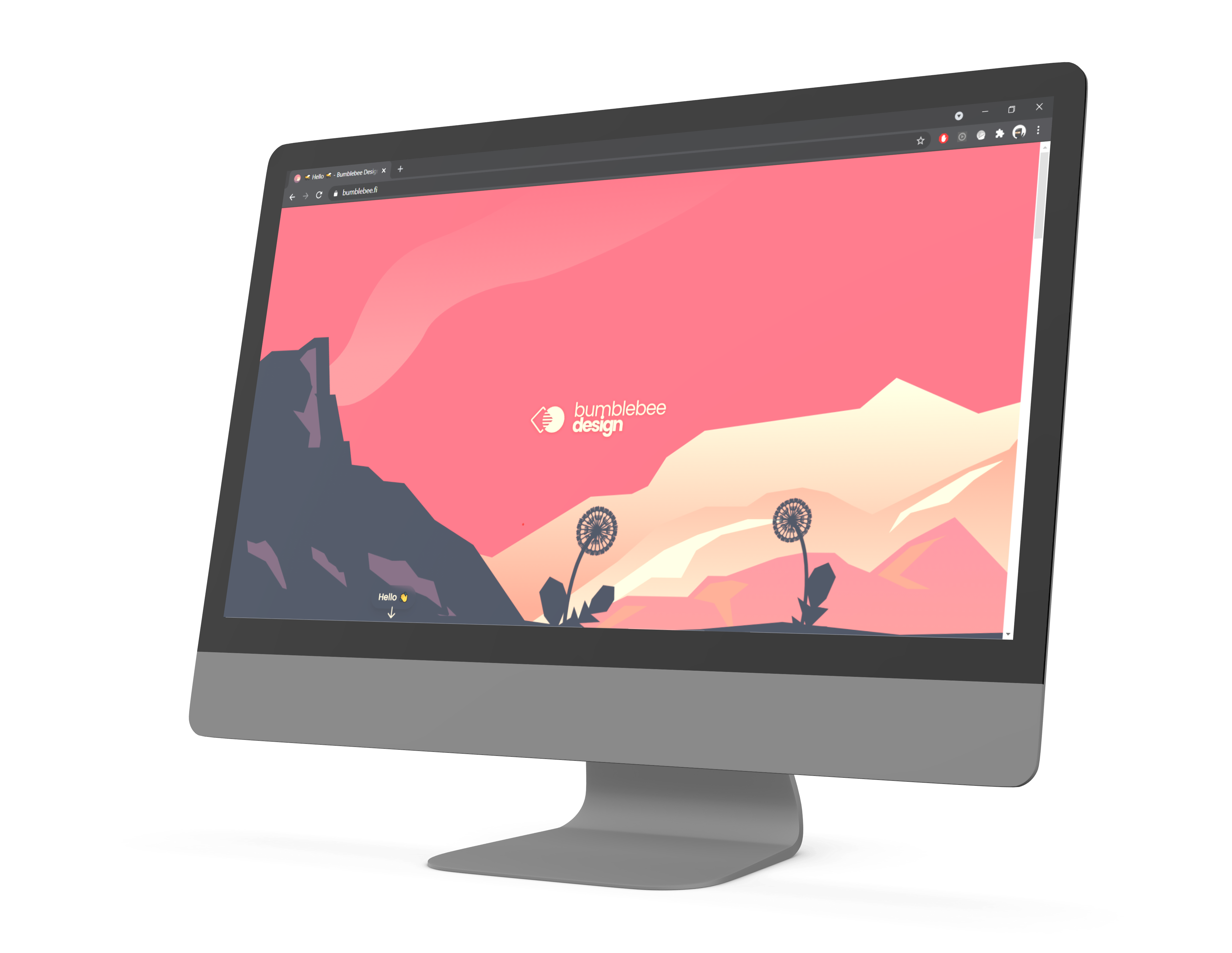
Web design and layout
The logo design included a lot of deep dives into typography. So after the logo was out there, everything else just fell into their places. We wanted to just get our thing our there, the first version of it. So we decided to keep our content very simple at this point.
After we get our business rolling and up to speed, we will revise it with greater thought.
Web pages and integrations
Setting things up
The next thing was to get our website and infrastructure in place. We needed a domain, corresponding email addresses, hosting service and the actual web site.
We wanted to have simple and intuitive web service that wouldn't get into our way. Google's Gmail and Drive and other services were already familiar to us, so we chose to go with Google's services for businesses. This would support us scaling up in the future easily, if such a need would occur.
I wanted to keep the costs of the infrastructure as low as possible, so that called for a bit of DIY with the infra.
JAMStack <3 me
I also wanted to maintain full control over how things looked and behaved, which meant coding the site from scratch. I chose a JAMStack approach and Git-based workflow for authoring and publishing the site. Fun fact: This portfolio site you're now on is built with JAMStack as well, with 11ty, Git-based workflow and deploying through Netlify.
I ended up with following:
- Web hosting and domain from OVH
- Google services (such as email) with custom domain
- Website Continuous Integration with GitLab and GitLab Pages
- Website implementation with Gridsome (Vue.js based static site generator) and TailwindCSS.
Testing the site
Ok, the site was looking nice, was up and functional. Would it perform well? How people would react to it?
It turned out that with just a little bit of optimization, I was able to bump the Lighthouse scores nicely.
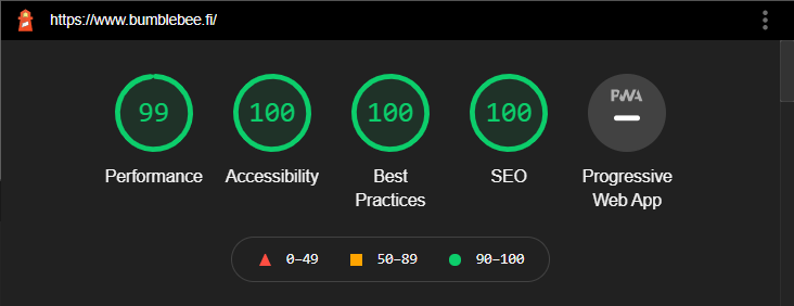
The desktop scores were really good.
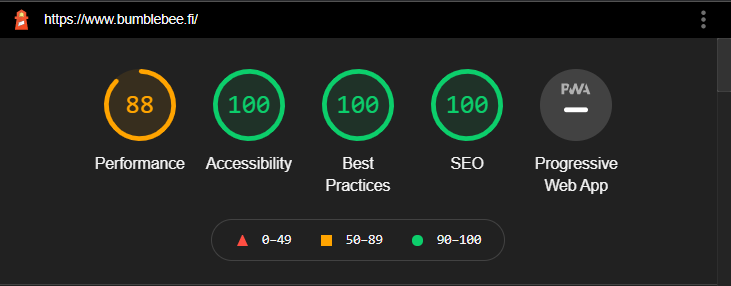
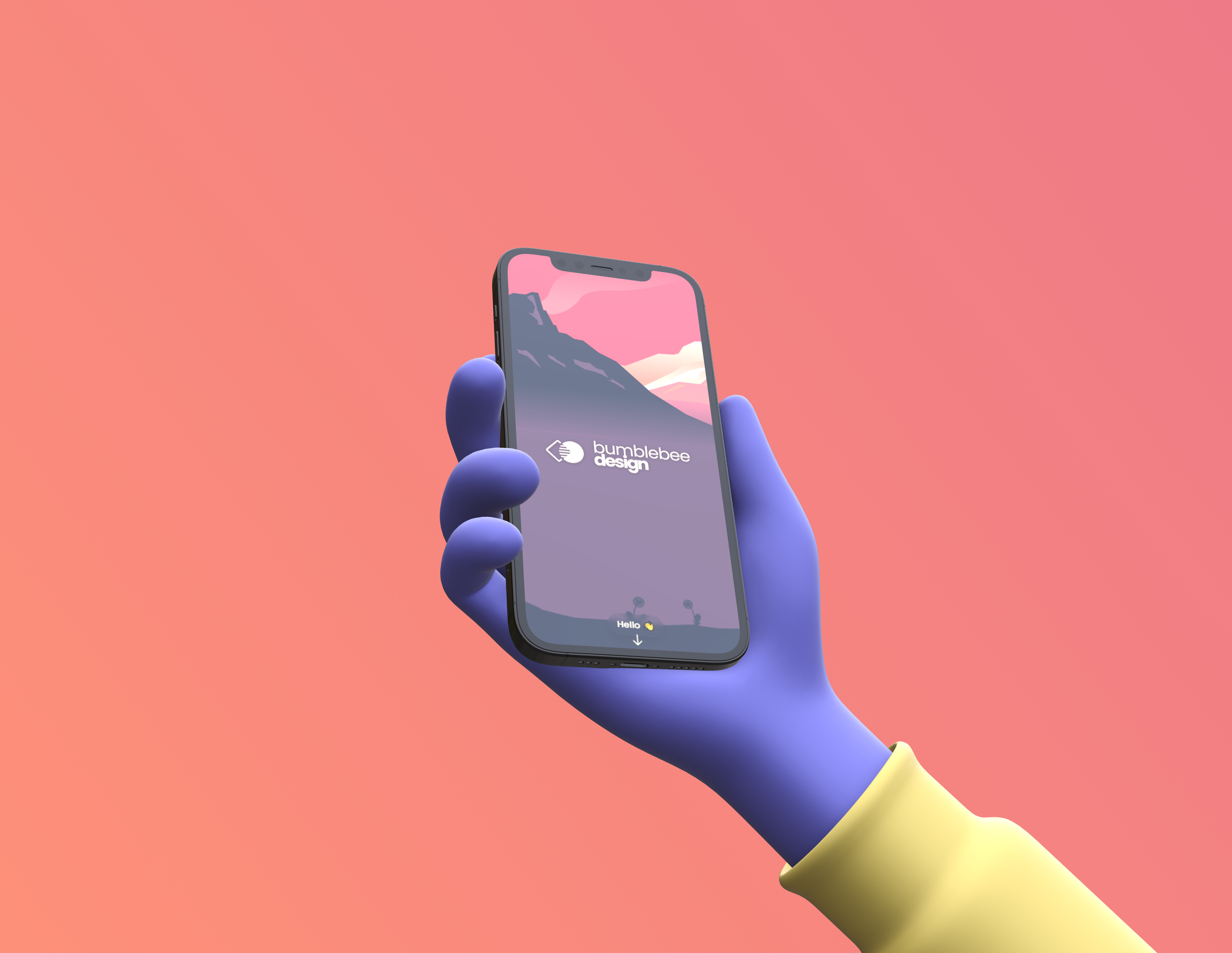
There is some room for optimization on mobile still.
Now, Lighthouse scores might not actually tell anything about the site or its user experience. They are not very good diagnostic for the UX. So we asked around. The feedback we received was very positive, some spontaneuos reactions including phrasing like: "smooth, fast and reactive", "beautiful" and "I like the natural, soothing and balanced feel".
Next steps
I'm now in pursuit of opportunities that would allow me to transfer my career into full-time freelancing. That way, we could focus on our business and continue building the site further. We are planning on adding our service description, indicative pricing and references in the near future.